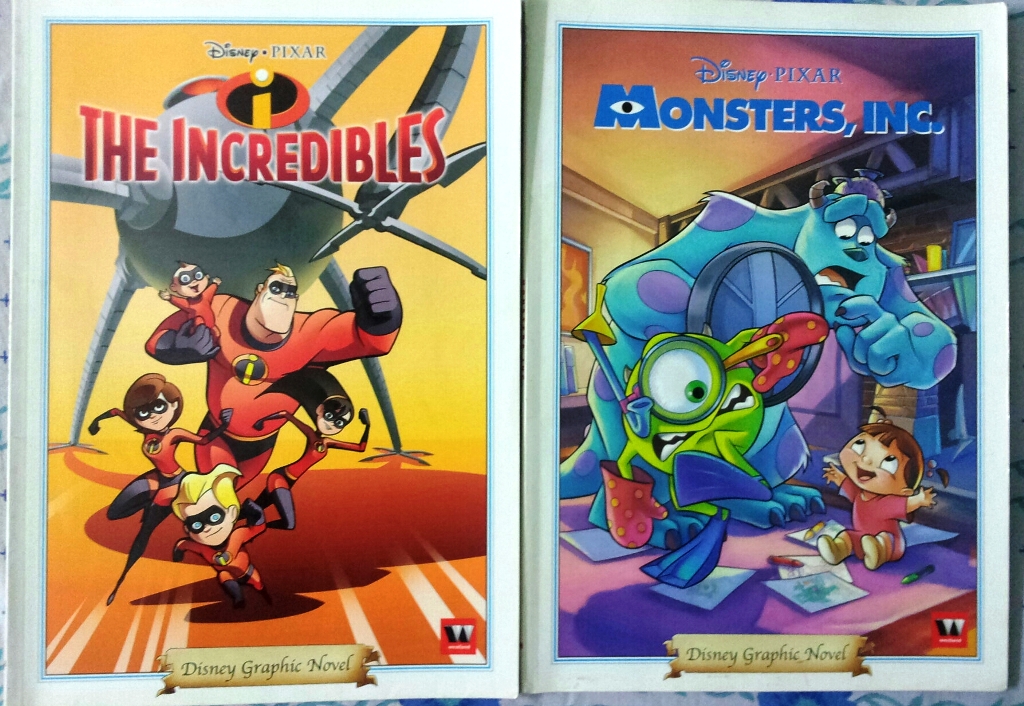
Quite some time ago, I came across these books – graphic novel adaptations of Monsters, Inc. and The Incredibles. I am almost sure that Disney has released graphic novel adaptations of other movies (especially those by Pixar) but I am yet to come across them.
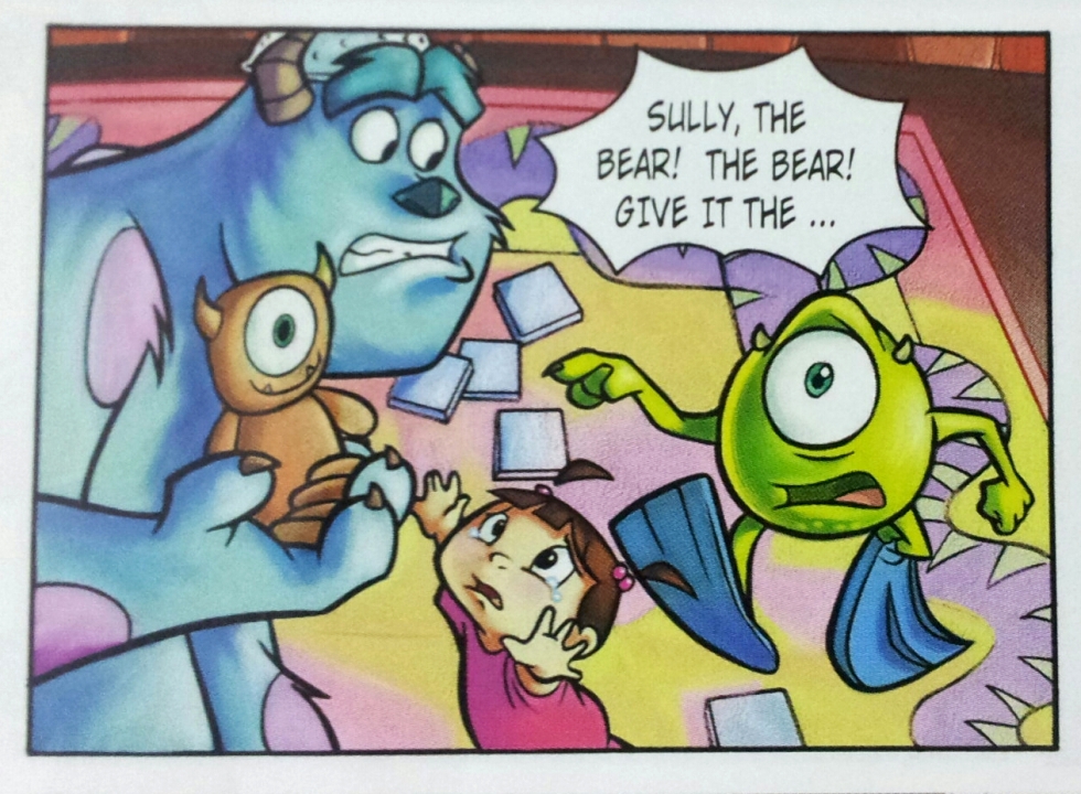
The books have very unique looks to them. Monsters has a very classy artwork. The design of “Boo” has been considerably altered from the movie.
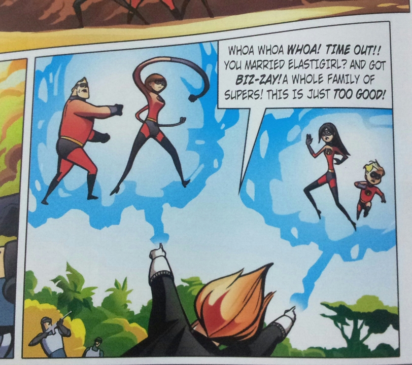
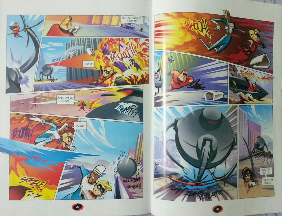
On the other hand, Incredibles has a very modern angular design to its characters. The reason might be to emphasize the action oriented nature of the story itself. The angular design was prevalent even in its 3D avatar animated by Pixar. I have come across this design philosophy for 2D characters in many modern American animated series’.
There is an inherent problem in adapting a mid-sized book to a film. We know that the screenwriter has to cut down many events in order to fit things in a two hour movie. A similar situation arises when a two hour movie has to be reduced to a mere 48 page book. To keep things in perspective, we can take the example of a typical Naruto episode. A high-pace twenty minute episode is usually made from two or three chapters of manga, which has about 40-60 pages. Extrapolating the same and taking into account the extra panels per page of the graphic novel format, we can assume that the optimum length of a graphic novel that can take care of the movies would be about 150 pages.
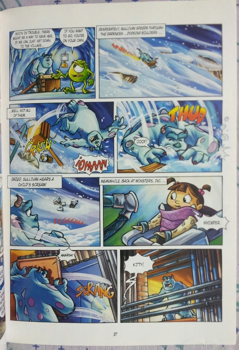
In order to accommodate the story into 48 pages, the artists have used a lot of exposition and frame contraction in Monsters, Inc.
On the other hand, The Incredibles relies on a lot of disjoint action oriented panels to take care of the contraction.
Somewhere, the flow of the graphic novels are seriously hampered by these contractions. John Lasseter‘s team under the direction of Pete Docter and Brad Bird did awesome jobs in bringing two distinct and rich stories to life. However, these graphic novels are nowhere near the movies – only shadows of the real thing.

