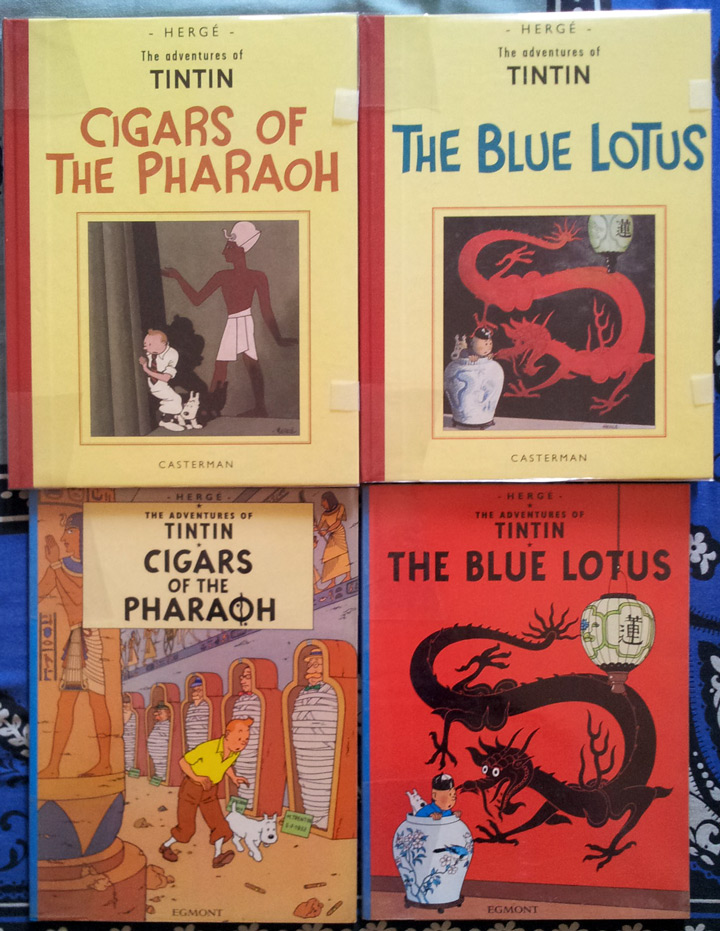
Cigars of the Pharaoh and The Blue Lotus form a larger story arc that is commonly dubbed as Tintin in the Orient. Indeed, it was the first time that Hergé ditched the episodic format in favour of strory arcs. Recently, I managed to get hold of these two albums in their original B&W format (see here). These are facsimile editions published by Casterman. The good news for the English fans is that these facsimiles are also translated by Michael Turner and Leslie Lonsdale-Cooper.
Original Cigars in retrospect
The original B&W edition of Cigars feels very much outdated. There are still signs of racial stereotyping. For those who have read the older albums, Soviet, Congo or America, they may find it quite toned down. However in Tintin’s interactions with Patrash Pasha, his arrival to Mecca during military mobilisation and later with the Indians, there are heavy tones of not only racial but also religious supremacy of Christian Europeans. The character backgrounds and dialogues were later altered in order to remove any direct references, however, the undertones are still present in the colour version – albeit very subtle.
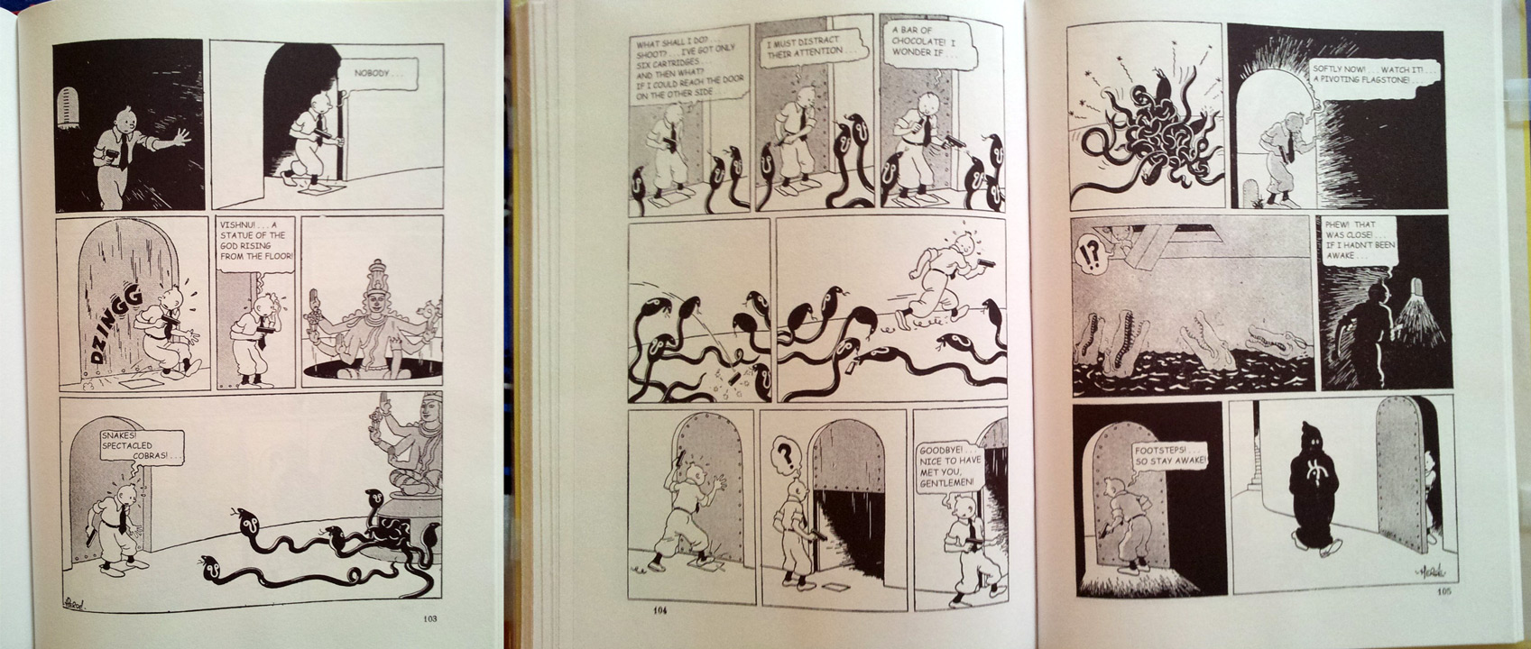
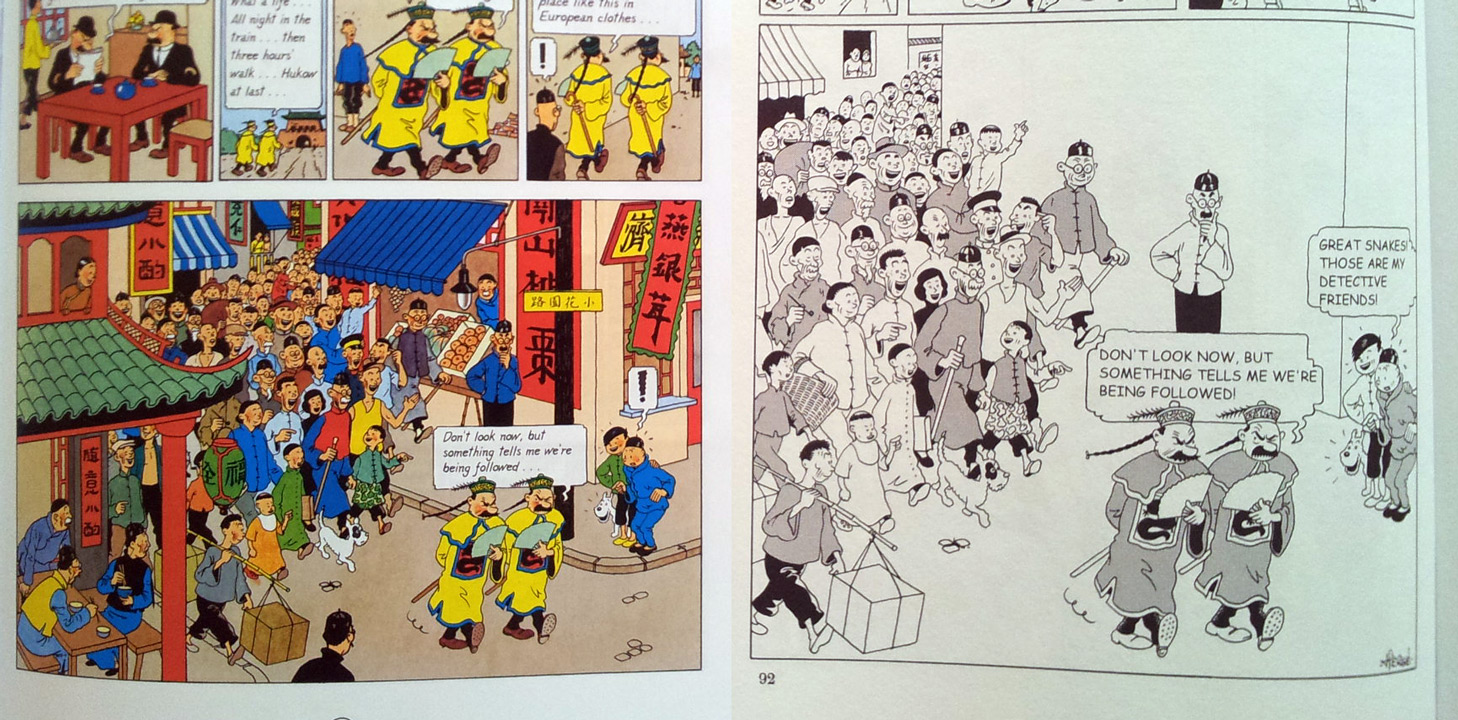
While redrawing, Hergé decided to cut a lot of things. Elaborate, meaningless sequences like these have been cut out.
Yet, there is only so much Hergé could have done without altering the story. As a result there are innumerable occasions where Tintin gets saved by sheer dumb luck.
The characters were redesigned, too. Notably, Professor Sarcophagus and poet Zloty. Tintin’s arch enemy, Rastapopoulus is introduced early on in Cigars. His appearance throughout the entire series remains relatively unchanged with respect to the one in the B&W edition. Oh! and Hergé introduces the twins, too. They are named as X33 and X33A though.
There are two anachronisms in the newer coloured edition. Early on, Snowy talks about Marlinspike. In the B&W edition, he merely says “Oh No”. They hadn’t meet Captain Haddock, yet, and Captain was yet to inherit is ancestral legacy. Later Tintin is shown Destination Moon by Patrash Pasha. During the events of Cigars, moon was unconquered and Tintin hadn’t met Calculus, yet. In the original B&W edition Pasha shows him Tintin in Congo.
If there is one word that sums up Cigars, it would be “rework”. Truly, Hergé had to do a lot of rework in order to bring it to the standards that were set by the moon albums. Still, it is not considered among Hergé’s best because of the way it was written in the first place. The outdated notions and jittery narrative prohibited him from giving it the same polish as say, Blue Lotus.
Hergé got it First-Time-Right with The Blue Lotus
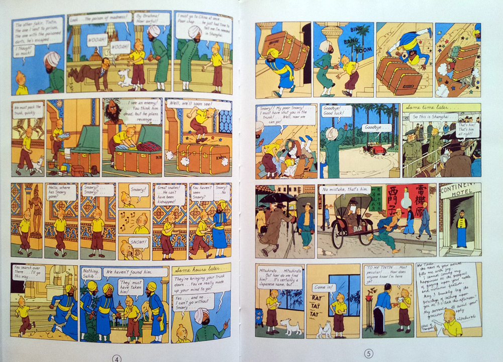
Have you ever observed the sudden change in drawing style from page 4 to page 5 of the current colour edition of The Blue Lotus? I had noticed this long back in the Bengali translation, “Neelkamal”, during my school days.
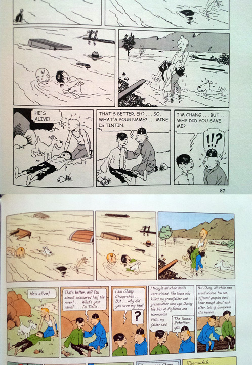
This is because there wasn’t much requirement of redrawing The Blue Lotus during its recolourisation process. The original B&W edition is as close to perfection as possible. Hergé made a new friend in real life, Zhang Chongren. He exposed him to ligne claire and Chinese culture. Unlike the racial stereotyping in his earlier works, Hergé makes a genuine attempt to dispel myths about the Chinese culture. Tintin and Chang have a hearty talk that somehow transcends prejudiced barriers even in the minds of the the readers.
The basic drawing of the panels were retained and were only cropped and re-arranged for the coloured version.
In most of the panels, backgrounds was added during the recolourisation process.
Nonetheless, The Blue Lotus doesn’t lose its charm even in its early avatar. It is a phenomenal book and I consider it amongst Hergé’s masterpieces.
Should I get these Casterman Editions?
If you are a casual Tintin reader, the short answer is, “No!”. You would be better off buying the standard coloured editions. If you are new to Tintin, may I suggest you to avoid Cigars for the time being? The Blue Lotus would be a good choice, though.
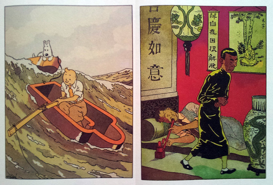
If you are a collector, then I would like to point out a few things that I disliked. Of course, one panel pages like these are not there in the newer editions and may themselves be worth the price.
As described in an earlier post, the hardcover is a very generic library binding with thin printed paper (the cover art) glued on top. Only the cloth is visible at the spine and there is no way you would know which book it is if viewed from the side.
Also, Robert Bringhurst would first kill himself and then turn in his grave if he knew that Casterman used Comic Sans in the speech bubbles. Comic Sans? Seriously! Are you kidding me? I had no objection when the English edition decided to replace Neil Hyslop’s handwriting with a digital font based on Hergé’s own, even though Hyslop’s lettering looked better. But, using Comic Sans in a Tintin album is blasphemous.
I wish Casterman had put a bit more thought while publishing these editions. The only demographic they are catering to are the hard core Tintin fans and collectors. I don’t think they are very happy with the offering.
Do you own these editions? If so, what do like / dislike about them? And, if you are a casual Tintin reader, what do you think of the coloured versions? Please leave a comment below.

