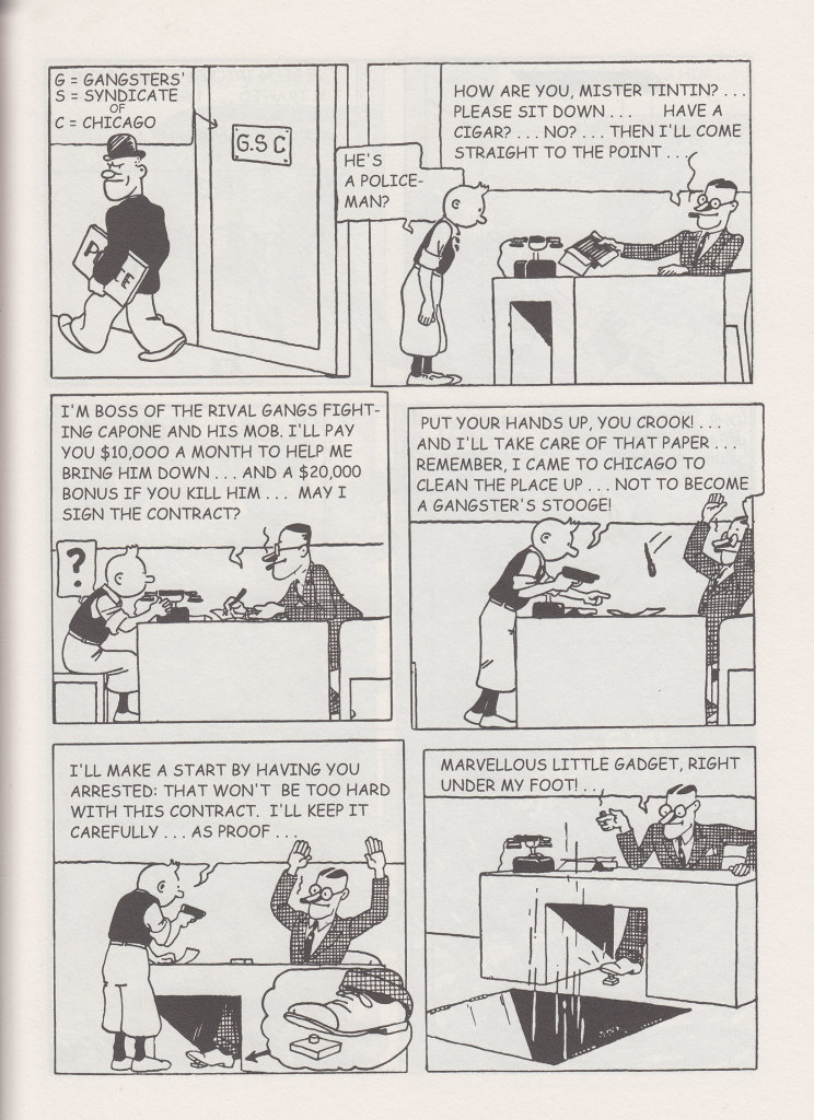
Just like the two volumes of Tintin in Orient, there is a B&W facsimile edition of Tintin in America. Last month I managed to get my hands on one of the copies.
Chronologically, Tintin in America came much earlier than Cigars of the Pharaoh or The Blue Lotus. This was the time when Tintin as a character was still going through many changes. Hergé himself had not established the character.
As a story, Tintin in America more or less follows the blueprint of its predecessor, Tintin in the Land of Soviets. Hergé mercilessly throws Tintin into the weirdest of situations and acts as Deus ex Machina to rescue him few panels or pages later. The prohibition era America is caricatured in this album, when drug mafia ruled Chicago, the Red Indians were forced away from their habitat, the poor labours weren’t happy with the wealthy and the wealthy themselves went around snatching any oil wells discovered. Each scenario possessed a new threat to Tintin. In fact, real life figures like Al Capone makes a cameo. For the general unification of these disjoint scenes, Hergé introduced a meta-villain, Bobby Smiles, shrewd enough to manipulate the mafia, the Red Indians and the wealthy.
Panels of Tintin in America are hardly altered
Cigars of the Pharaoh was slightly altered in the colour upgrade in order to match the tone of the later albums. The Blue Lotus did not need such an upgrade since Hergé’s storytelling had already evolved. In comparison, Tintin in America had almost no upgrade, albeit for a different reason than its successor, The Blue Lotus. Upgrading it would have required a complete overhaul of the story. I guess, Herge did not even attempt a colour version of Soviets for this exact reason. The colour version is nearly exact panel to panel transformation of the black and white version. There are a few design changes and some alterations in the names. Other than that, there aren’t any remarkable changes.
Racial censorship forced Hergé to alter a lot of panels in his upgraded colour albums. Tintin in America is no exception. The number of such altered panels in this story is surprisingly very less.
Like the other volumes in the series, this book is set in Comic Sans. Personally, I detest that font. It is one of the worst kerned fonts that exist in the popular pool of fonts. This was published by Casterman and they could have easily used the digital font based on Herge’s handwriting as used by Egmont.
Full panel spreads
The original four-colour, full-page spreads are kept intact. The style of these panels are close to the panels that would become a staple of books emerging out of Studio Herge. Sadly, barring a few full page panels in The Crab with Golden Claws and one blueprint in Destination Moon, the later books completely omitted this full page cinematic experience.
My childhood with Tintin kickstarted here
The Bengali translation of the coloured edition was my first Tintin book. Even though as an adult, the story doesn’t make sense, this book holds a lot of nostalgic memories. As a kid, I enjoyed the coloured edition and I guess, a kid today would be able to enjoy it as well.
The black and white edition, on the other hand, is strictly for the collectors.


